
PLATFORM WORKFLOW
Task Description: Other Advanced Settings and Actions in Forms and Surveys
Objective: To show Organization Admins permission level and Users how to configure other advance settings and actions in forms and surveys
Organization: All
System Permission Level: System Admin/User and Organization Admin/User
The Other tab houses advanced settings that give you greater control over how your form or survey behaves, responds, and appears. From defining what happens after submission to enhancing the user experience with visual elements and tracking tools, this section lets you fine-tune the final details that shape your form’s overall functionality and presentation.
The Other tab is organized into nine folders:
- Show Form/Survey Name: Choose whether the survey name appears at the top of the form.
- Action on Submission: Define what happens when someone successfully completes the survey.
- Action on Disqualify Immediately: Set an action to run the moment a disqualifying condition is met.
- Action on Disqualify on Submission: Trigger an action after submission if a disqualifying condition applies.
- Facebook Tracking Pixel: Add a Facebook pixel ID for tracking survey or form submissions.
- Additional Form Field Options: Enable Display one question at a time and Remember contact.
- Progress Bar: Add a visual indicator to show users how far along they are in the form or survey.
- Header: Insert content (text, or image) that appears at the top of your form or survey.
- Footer: Insert content that appears at the bottom of your form or survey.
In the next steps, we’ll walk through each section in detail.
Show Form/Survey Name
This setting controls whether the form or survey title appears at the top of your form.
- Show Form/Survey Name toggle: Turn this on to display the name at the top of the form or off to hide it.
- Form/Survey Name field: Update the text in this field to change how the name appears to users. This can be helpful if you want to display a shorter or more descriptive title than the one used internally.

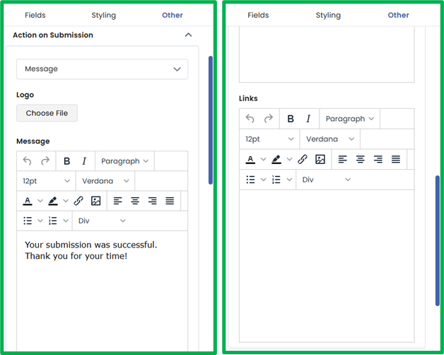
Action on Submission
This section defines what users experience immediately after submitting the form or survey. You can choose to either display a custom message or redirect users to another webpage.
Message: When this option is selected, three fields appear:
- Logo: Upload an image or logo to display on the submission screen.
- Message: Enter the text you want users to see after submission. This could be a confirmation, thank-you note, or next-step instructions.
- Links: Add any links you want to share with users such as to your website, social media pages, or additional resources.
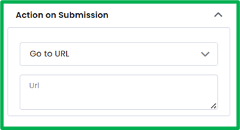
Go to URL: Select this option to redirect users to another webpage after submission. A URL textbox will appear where you can enter the web address of the page you want users to visit.
Action on Disqualify Immediately
This section functions the same way as Action on Submission, with identical fields and options. The difference is in when it’s triggered.
Instead of appearing after form submission, this action activates the moment a user selects an answer that meets a Disqualify Immediately condition in a Checkboxes, Dropdown, Multiple Choice, or Radio Buttons field.
Just like Action on Submission, you can choose to either:
- Display a Message with a custom logo, text, and optional links, or
- Go to URL to redirect users to another webpage.
If you’d like to learn how to add logic to a form or survey, check out the Form Logic Workflow for step-by-step guidance.
Action on Disqualify on Submission
This section functions the same way as Action on Submission, with identical fields and options. The difference is that it controls what users see after submitting the form when their responses meet a Disqualify After Submit condition.
This logic applies to Checkboxes, Dropdown, Multiple Choice, or Radio Buttons fields that have disqualifying rules set to trigger upon submission.
Just like Action on Submission, you can choose to either:
- Display a Message with a custom logo, text, and optional links, or
- Go to URL to redirect users to another webpage.
If you’d like to learn how to add logic to a form or survey, check out the Form Logic Workflow for step-by-step guidance.
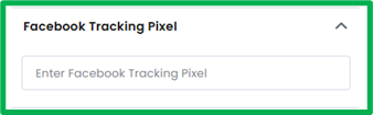
Facebook Tracking Pixel
This section allows you to integrate your form or survey with Facebook tracking for marketing and analytics purposes. By adding a Facebook Pixel ID, you can track user interactions.
- Facebook Tracking Pixel: Enter your unique Pixel ID in this field to connect the form or survey to your Facebook account. Once added, Facebook will begin recording relevant user activity, allowing you to analyze engagement, conversions, and audience behavior directly from your Facebook Ads Manager.
Additional Form Field Options
This section contains settings that enhance the user experience and control how your form behaves.
- Display One Question at a Time: Toggle this on to show only one question per screen. Note: Enabling this option will disable any existing form logic.
- Remember Contact: Toggle this on to prefill form fields with known information for returning contacts. This helps users avoid entering the same information multiple times and streamlines the form completion process.

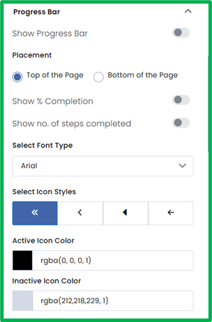
Progress Bar
This section lets you customize the look, placement, and behavior of the progress bar on your form or survey. The progress bar provides a visual indicator of a user’s progress as they move through the form.
- Show Progress Bar: Toggle this on to display a progress bar or off to hide it.
- Placement: Choose where the progress bar appears either at the Top of the Page or Bottom of the Page.
- Show % Completion: Toggle this on to display the completion percentage (e.g., 80% completed).
- Show No. of Steps Completed: Toggle this on to display the number of steps completed and total steps (e.g., Step 1 of 2).
Design and Style Options:
- Select Font Type: Choose a font from the dropdown list to customize the text style used in the progress bar.
- Select Icon Styles: Select an icon style to change the arrow icons displayed at both ends of the progress bar.
- Active Icon Color: Choose a color for the icon representing the current step.
- Inactive Icon Color: Choose a color for the icons representing steps that haven’t been reached yet.
Progress Bar Styles:
- Progress Bar Background Color: Use the color picker to choose the background color of the progress bar track.
- Progress Bar Color: Use the color picker to set the color of the filled portion of the progress bar, representing completed progress.

Progress Font Style:
- Font Color: Choose the color for the text displayed within the progress bar.
- Font Size: Enter a specific size value or use the up/down arrows to adjust text size incrementally.
- Font Weight: Select the thickness of the text (e.g., 100 (Thin) and 900 (Extra Bold)).

Active State Styles:
- Font Color: Choose the color of the text for the active (current) step.
- Font Size: Set or adjust the text size for the active step.
- Font Weight: Select the text thickness for the active step.

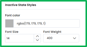
Inactive State Styles:
- Font Color: Choose the color of the text for inactive (upcoming) steps.
- Font Size: Set or adjust the text size for inactive steps.
- Font Weight: Select the text thickness for inactive steps.
Completed State Styles:
- Font Color: Choose the color of the text for completed steps.
- Font Size: Set or adjust the text size for completed steps.
- Font Weight: Select the text thickness for completed steps.

Header
This section allows you to add and customize the header that appears at the top of your form or survey. The header can include text, a logo, and background styling to help brand your form and create a professional appearance.
- Show Header: Toggle this on to display the header or off to hide it.
- Header Layout: Choose how the header content is aligned—Left, Center, or Right.

Background:
- Type: Select the background type—Solid, Linear, or Radial.
- Solid applies a single uniform color.
- Linear and Radial create gradient backgrounds.
- Color: Use the color picker to select the primary background color (or gradient color).
- Position: Choose where the gradient begins. Options increase in 10% increments (e.g., 0%, 10%, 20%, up to 100%).
- Rotation: Set the angle of the gradient to adjust the direction of the color transition. Options are available in 45° increments (e.g., 0°, 45°, 90°, 135°, etc.).
- Background Image: Optionally, upload an image from your device to use as the header background.

Header Text:
- Title: Enter the text that will appear in the header (e.g., your form or survey name).
- Font Color: Use the color picker to choose a color for the header text.
- Font Type: Select a font from the dropdown menu.
- Font Size: Manually enter a value or use the up/down arrows to adjust the text size.
- Font Weight: Choose the text thickness. Values adjust in increments of 100 (e.g., 100, 200, 300, up to 900).

Header Image:
- Upload Logo: Upload an image or logo from your files to display in the header alongside or above the header text.

Footer
This section functions the same way as the Header section, with identical fields and customization options. The only difference is that these settings control the footer, which appears at the bottom of your form or survey.
You can toggle the footer on or off, adjust its layout and background, customize text and font styles, and upload a logo or image to display. All field behaviors—including background type, color options, position and rotation increments, and font settings—match those found in the Header section.